3. Descriptive statistics
[1]:
freqlist <- read.table("https://bit.ly/35xnbuF", header=TRUE)
head(freqlist)
| WORD | FREQUENCY | |
|---|---|---|
| <fct> | <int> | |
| 1 | said | 12704 |
| 2 | know | 10202 |
| 3 | got | 8825 |
| 4 | get | 6756 |
| 5 | go | 6427 |
| 6 | think | 5961 |
[2]:
# plot
plot(freqlist$FREQUENCY,
     xlab="index of word types",
     ylab="frequency",
     main="plot of a frequency list",
     cex=0.6)

[3]:
# change type and line width lwd
plot(freqlist$FREQUENCY,
     type="l",
     lwd=2,
     xlab="index of word types",
     ylab="frequency",
     cex=0.6)

[4]:
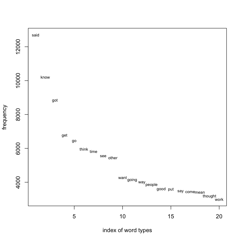
# show first 20 and plot label
plot(freqlist$FREQUENCY[1:20],
     xlab="index of word types",
     ylab="frequency",
     col="white")
text(freqlist$FREQUENCY[1:20],
     labels = freqlist$WORD[1:20],
     cex=0.7)
[5]:
# together
plot(freqlist$FREQUENCY[1:20],
     xlab="index of word types",
     ylab="frequency",
     type="l",
     col="lightgrey")
text(freqlist$FREQUENCY[1:20],
     labels = freqlist$WORD[1:20],
     cex=0.7)

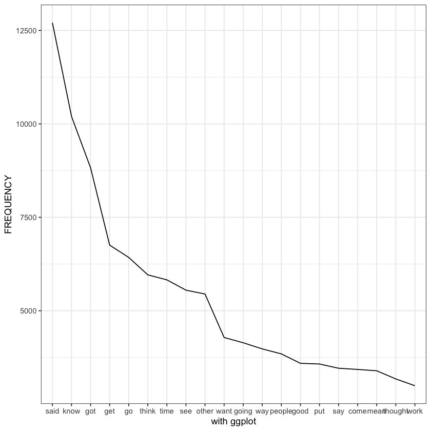
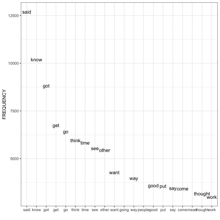
The distribution at work is known as Zipfian. It is named after Zipf’s law many rare events coexist with very few large events. The resulting curve continually decreases from its peak (although, strictly speaking, this is not a peak).
[7]:
# now with tidyverse
options(warn=-1)
options(messages=-1)
options(tidyverse.quiet = TRUE)
library(tidyverse)
[9]:
ggplot(freqlist[1:20,], aes(x = reorder(WORD, -FREQUENCY), y = FREQUENCY, group=1, label=WORD)) +
    geom_line() + # declare labels + use geom_text()
    xlab("with ggplot") + # we get rid of the xlab tags
    theme_bw()
[10]:
# no line but with text label
ggplot(freqlist[1:20,], aes(x = reorder(WORD, -FREQUENCY), y = FREQUENCY, group=1, label=WORD)) +
    geom_text(check_overlap = TRUE) + # declare labels + use geom_text()
    xlab("") +
    theme_bw()
[11]:
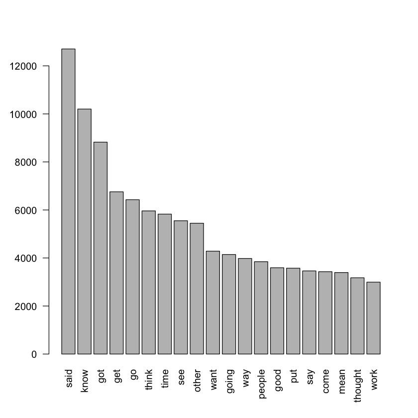
# bar plot, the las argument allows you to decide if the labels are parallel (las=0) or perpendic- ular (las=2) to the x-axis.
barplot(freqlist$FREQUENCY[1:20],names.arg = freqlist$WORD[1:20], las=2)
[12]:
# ggplot
ggplot(freqlist[1:20,], aes(x = reorder(WORD, -FREQUENCY), y = FREQUENCY)) +
  geom_col() +
  xlab("WORD") +
  theme(axis.text.x = element_text(angle = 90, vjust = 0.5, hjust=1))

[15]:
hist(freqlist$FREQUENCY[1:100], xlab="frequency bins", las=2, main="")
ggplot(freqlist[1:100,], aes(x=FREQUENCY)) +
  stat_bin(binwidth = 400) +
  theme_bw()


[18]:
data <- readRDS(url("https://bit.ly/2TRdVuM"))
[19]:
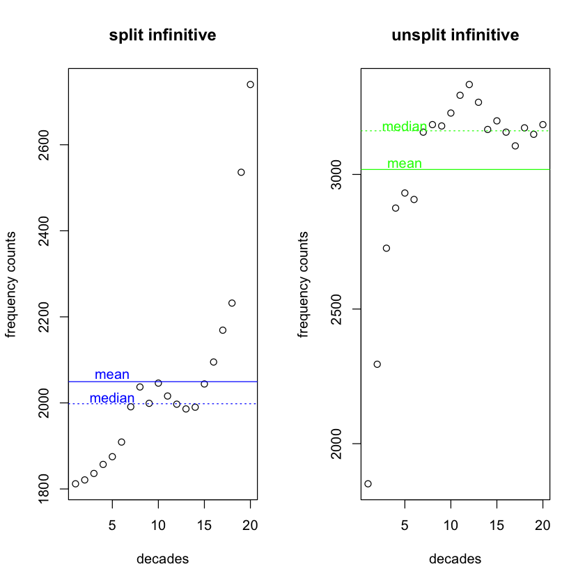
# To visualize where the mean stands in your dat
par(mfrow=c(1,2))

# first plot
plot(data$SPLIT_INFINITIVE, xlab="decades", ylab="frequency counts", main="split infinitive")
abline(h = mean(data$SPLIT_INFINITIVE), col="blue")
text(5, mean(data$SPLIT_INFINITIVE)+15, "mean", col="blue")

# second plot
plot(data$UNSPLIT_INFINITIVE, xlab="decades", ylab="frequency counts", main="unsplit infinitive")
abline(h = mean(data$UNSPLIT_INFINITIVE), col="green")
text(5, mean(data$UNSPLIT_INFINITIVE)+20, "mean", col="green")

[20]:
# median and mean
par(mfrow=c(1,2))

# first plot
plot(data$SPLIT_INFINITIVE, xlab="decades", ylab="frequency counts", main="split infinitive")
abline(h = mean(data$SPLIT_INFINITIVE), col="blue")
abline(h = median(data$SPLIT_INFINITIVE), col="blue", lty=3)
text(5, mean(data$SPLIT_INFINITIVE)+15, "mean", col="blue")
text(5, median(data$SPLIT_INFINITIVE)+15, "median", col="blue")

# second plot
plot(data$UNSPLIT_INFINITIVE, xlab="decades", ylab="frequency counts", main="unsplit infinitive")
abline(h = mean(data$UNSPLIT_INFINITIVE), col="green")
abline(h = median(data$UNSPLIT_INFINITIVE), col="green", lty=3)
text(5, mean(data$UNSPLIT_INFINITIVE)+20, "mean", col="green")
text(5, median(data$UNSPLIT_INFINITIVE)+20, "median", col="green")
[22]:
# mode
df.each.every <- read.delim("https://bit.ly/3oSdIWn", header=TRUE)

df <- df.each.every %>%
  count(NP_tag) %>%
  rename(count = n)

ggplot(df, aes(x=NP_tag, y=count)) +
  geom_bar(stat = "identity")

[23]:
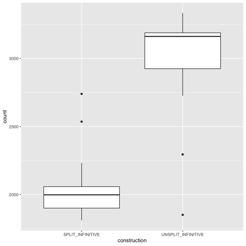
data.tidy <- data %>%
pivot_longer(
!(DECADE), # all the columns except 'DECADE' are concerned
names_to = "construction", # new column
values_to = "count", # where the counts will appear
values_drop_na = TRUE # do not include NA values (providing NA values appear)
)
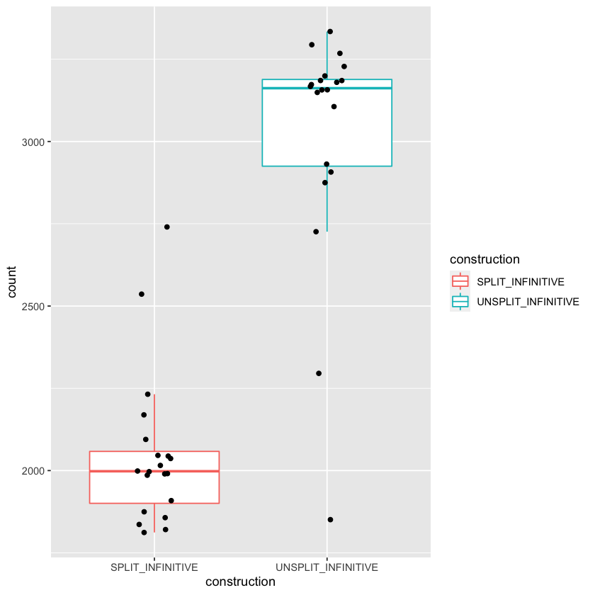
head(data.tidy) # i
p <- ggplot(data.tidy, aes(construction, count))
p + geom_boxplot()
| DECADE | construction | count |
|---|---|---|
| <int> | <chr> | <int> |
| 1810 | SPLIT_INFINITIVE | 1812 |
| 1810 | UNSPLIT_INFINITIVE | 1851 |
| 1820 | SPLIT_INFINITIVE | 1821 |
| 1820 | UNSPLIT_INFINITIVE | 2295 |
| 1830 | SPLIT_INFINITIVE | 1836 |
| 1830 | UNSPLIT_INFINITIVE | 2726 |
[24]:
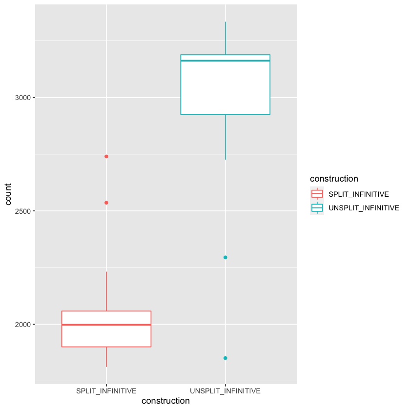
# colors
p + geom_boxplot(aes(colour = construction))
[25]:
# with data points
p + geom_boxplot(aes(colour = construction), outlier.shape = NA) + geom_jitter(width = 0.1)